A calm, classic look for the flowing space in an urban apartmentEasy, elegant style, with pops of contemporary colour and thoughtful details make this city pad chic but comfortable
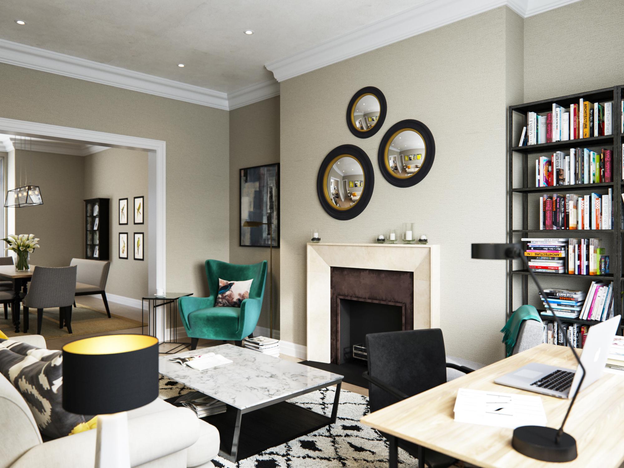
A timeless linen shade creates an easy-going backdrop for the whole space, punctuated by black accents and shots of yellow, teal and grey. All the furniture has been chosen for its crisp, light lines. Notice how you can see through the coffee tables and shelving — a brilliant way to boost the sense of space. The fireplace makes a traditional focal point, but the three mirrors above look refreshingly contemporary and their circular shape is repeated in the lamps flanking the sofa. ‘The space has a calm, airy feel,’ explains Emma. ‘It’s not too precious, not too casual
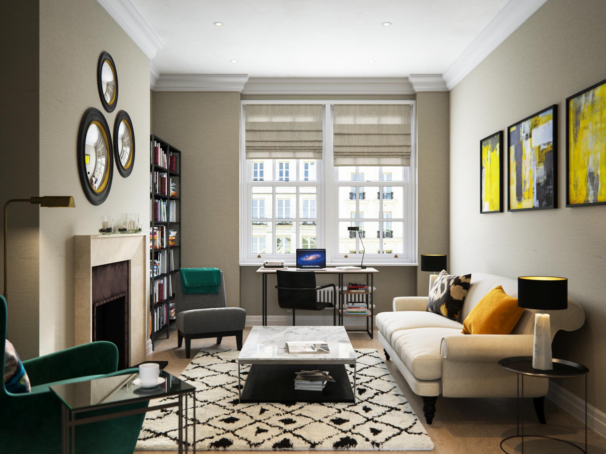
It’s often not the amount of furniture but its proportions that make or break a space. All the pieces in this room have been carefully selected to complement each other in design and functionality, but also in scale. The inviting sofa is big enough for three, but sits neatly on black legs, giving it a light appearance and boosting the feeling of space. It is complemented by a handsome winged armchair while a small chair works as flexible, occasional seating. This allows the living space to move from relaxation zone to sociable hub, seating six or seven people comfortably.
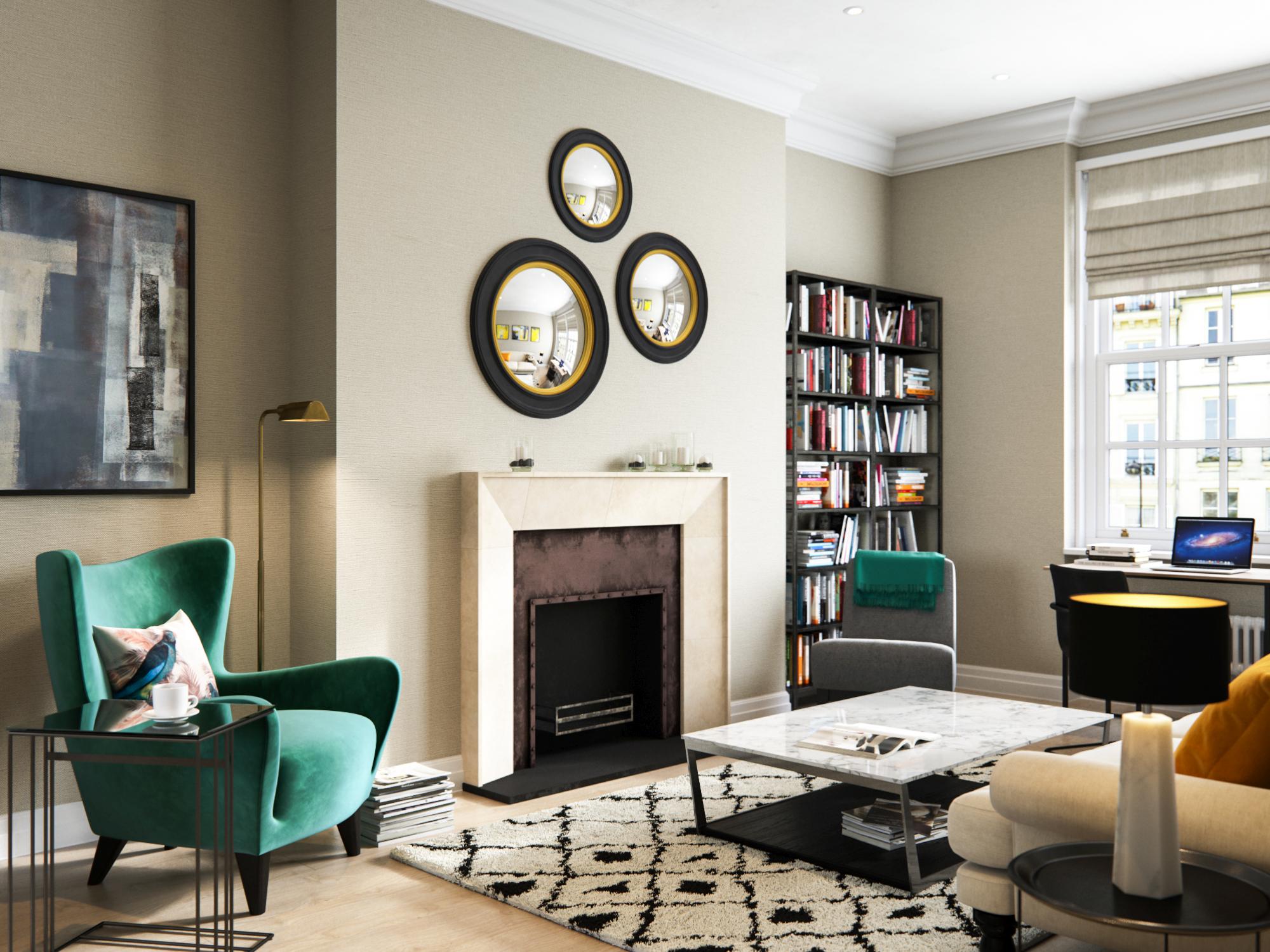
This living space multitasks cleverly as somewhere to relax, work or entertain. Despite its modest footprint, it contains a versatile mix of pieces selected which help this room work hard, but feel stylish and comfortable. The sofa is a comfy chill-out spot, but there is also space to work at a desk slotted neatly in the window. The alcoves, meanwhile, are designed as storage and as a quiet reading corner, complete with statement armchair. A marble-topped table, sitting on a tribal rug, makes a beautiful and practical pivot point for the whole scheme.
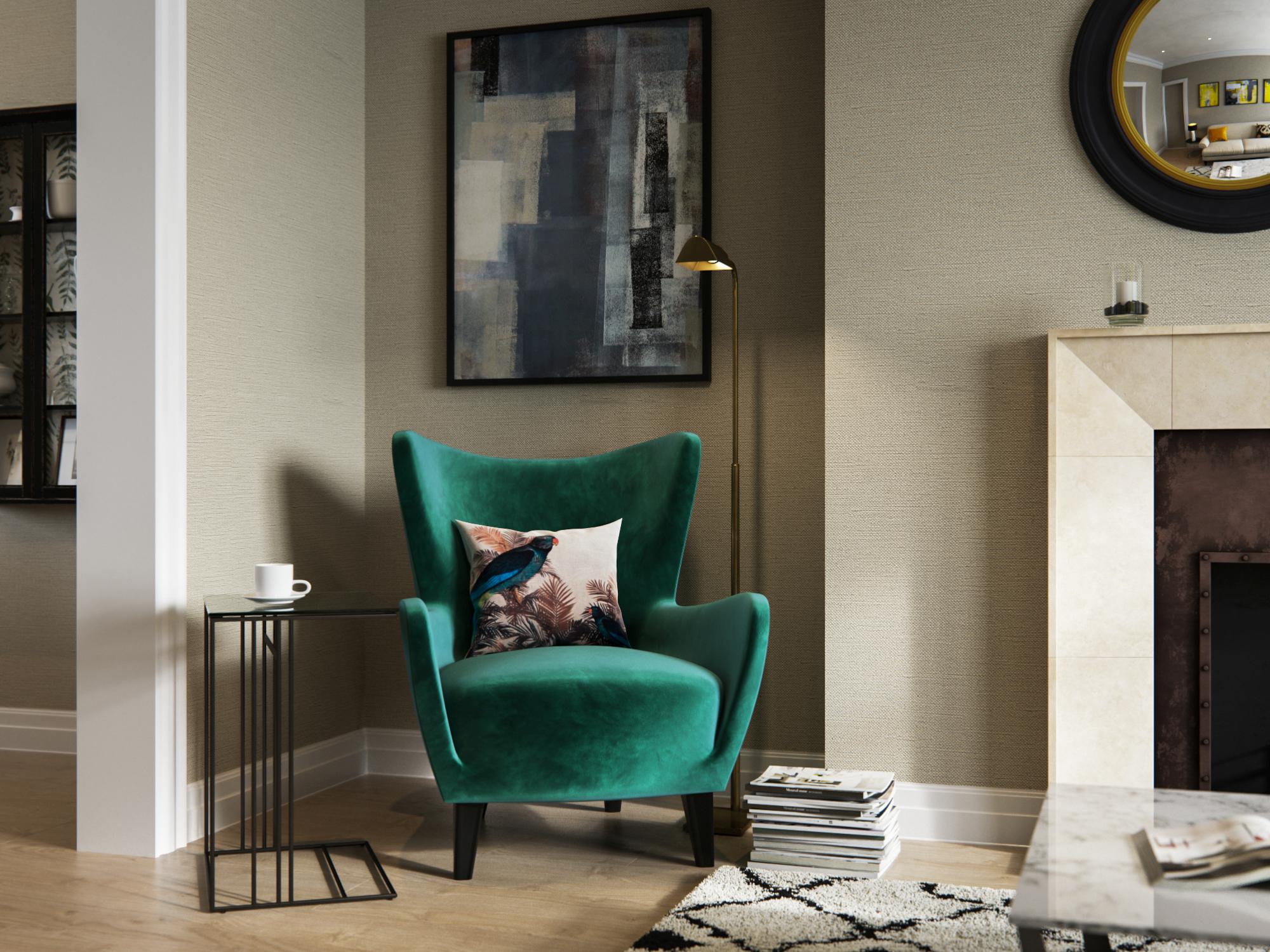
This armchair is the ‘wow’ element of this room, its teal upholstery singing out against the neutral backdrop. It is a reworking of a traditional wingback chair and cleverly combines classic design with contemporary styling. The simple brass floor lamp helps zone this as a spot to read or sit quietly in, while the metal table provides somewhere to rest a book on, its barely-there appearance preventing it from cluttering this corner. The abstract art above adds detail and links nicely with the trio of prints above the sofa opposite.
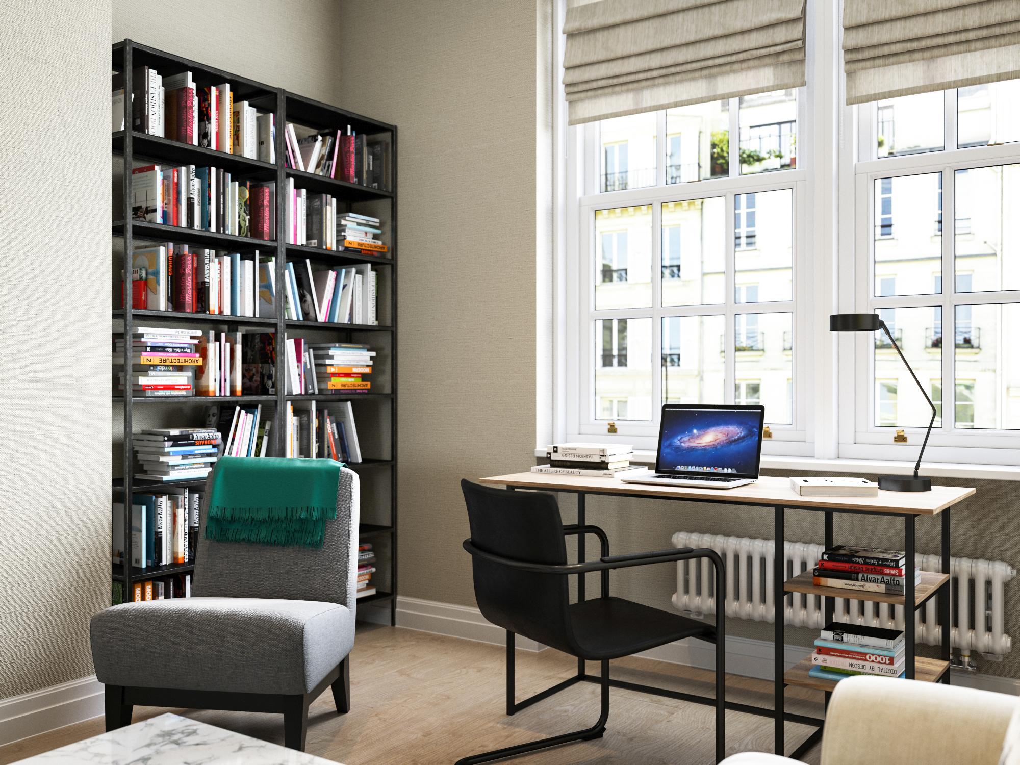
Work space is vital in a contemporary apartment, but a tiny table is frustrating to use, so this room boasts a proper work station. The desk fits nicely under the window, where it benefits from natural light, and its slim silhouette helps it disappear into the background. The chair, which has comfortable arm rests, is equally lightweight, and there is handy shelving in the alcove for books and files. Again, this storage is black to tie in with the rest of the room and slim in style, helping this area feel unobtrusive. At the window, practical Roman blinds allow maximum light in without obstructing the desk or view. Made from a linen-mix fabric, they perfectly complement the wall covering, which is woven from grass and brings delicate texture to both rooms.
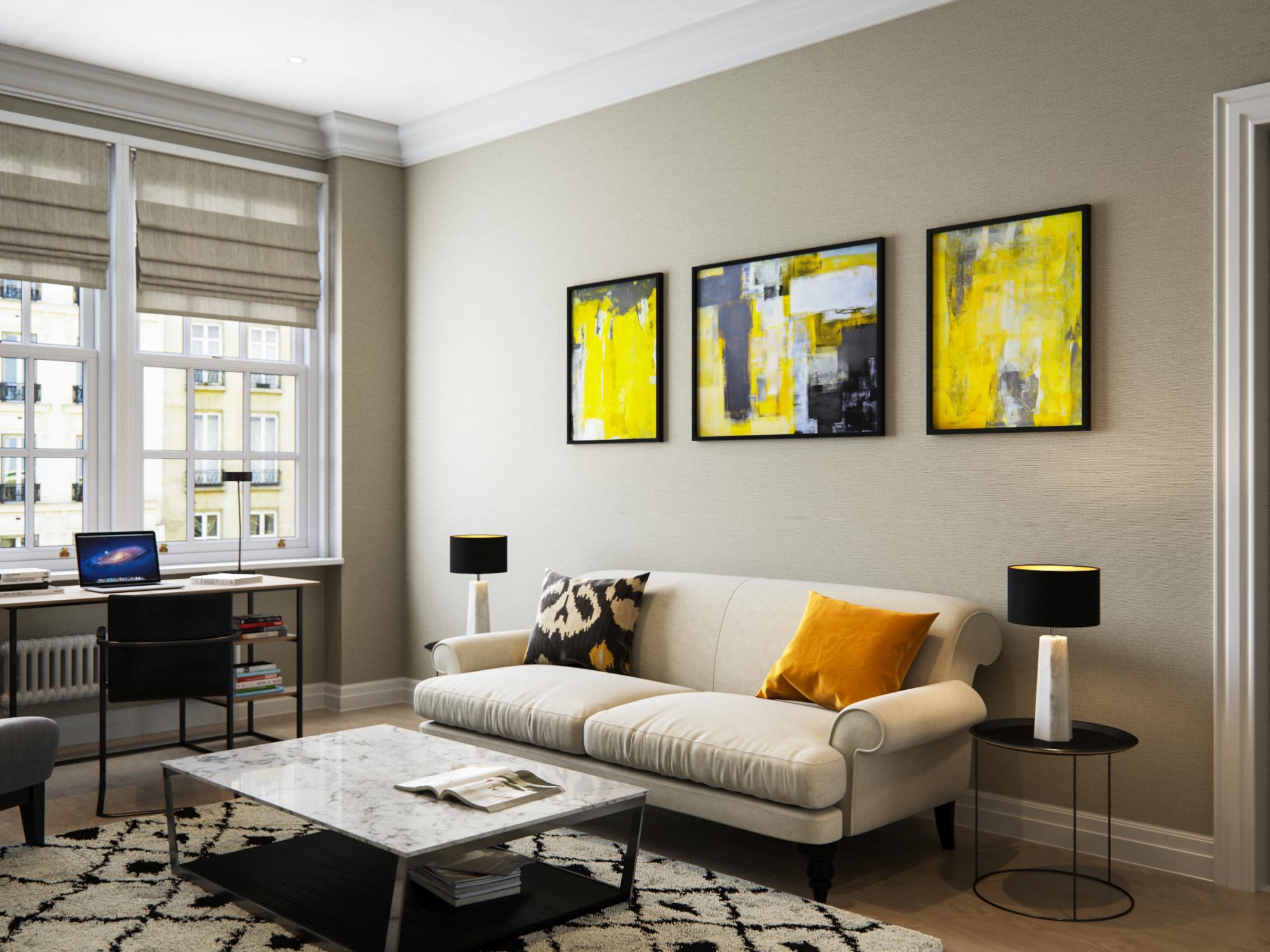
Striking art injects energy into this neutral, classic interior, giving it an exciting, contemporary edge. The dark frames help it link beautifully with the other black accents threaded throughout and create a sense of symmetry. The central picture is flanked by two smaller ones, while the sofa itself is balanced by matching lamps and slinky side tables at each end. To give this vibrant yellow a context, it is picked up on the cushion and even on the parrot prints in the dining area. The art above the armchair opposite has softer tones but is similarly abstract, for a harmonious feel.
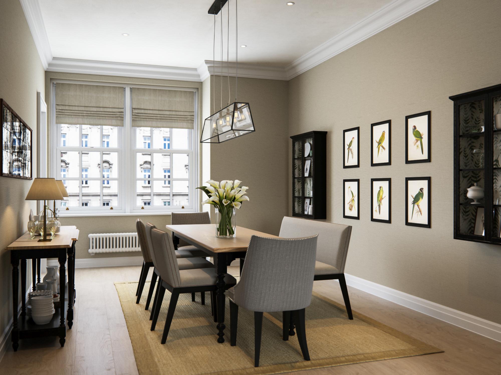
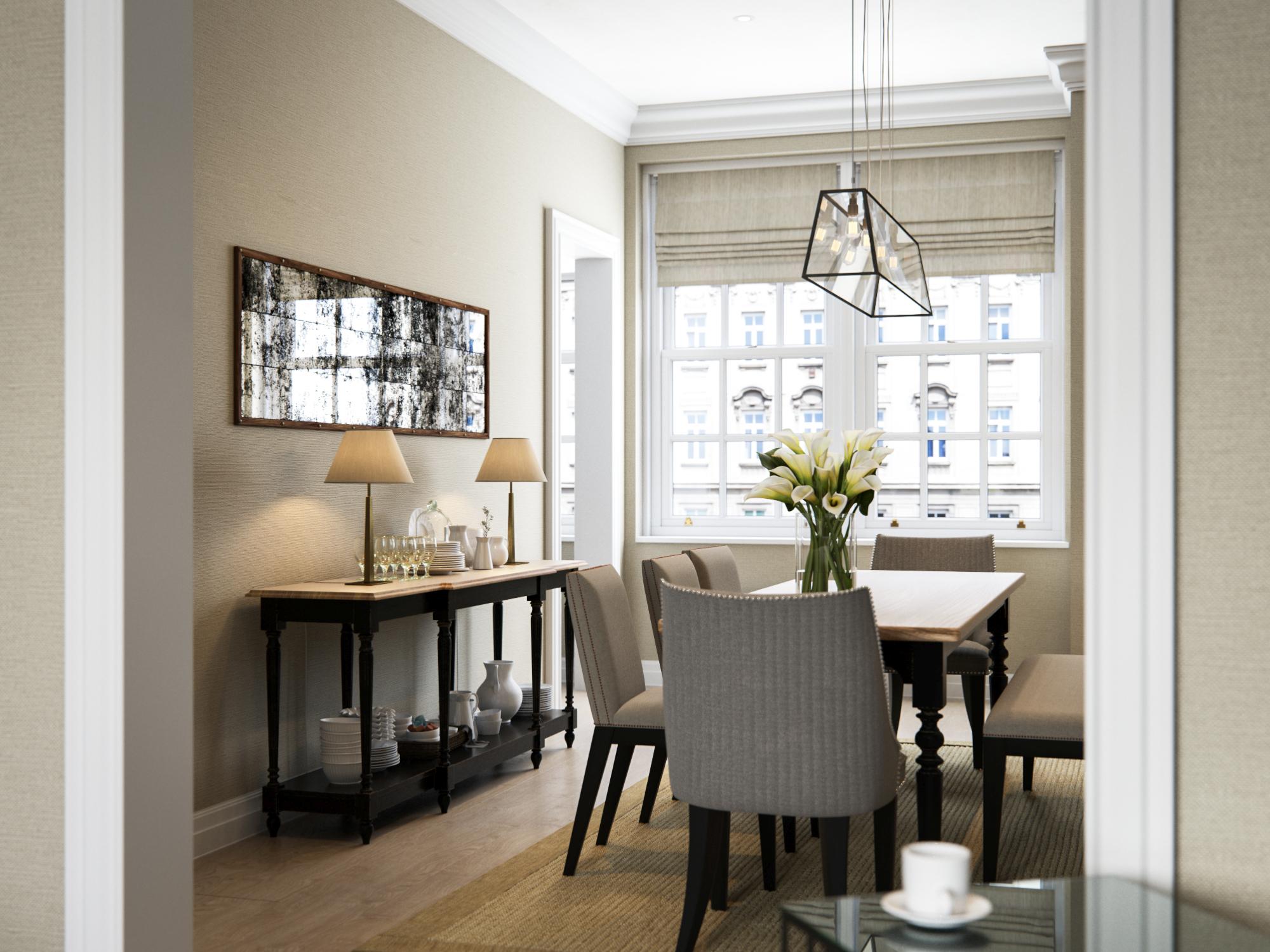
A dining space is an asset in any apartment, but it needs to work hard to earn its place! Here, the table is beautifully slim, so it doesn’t overwhelm the room, yet still provides space for everything from homework to entertaining. A flexible mix of chairs and a bench can seat a crowd, while the elegant console table and wall units provide valuable storage and help the room feel properly fleshed out. A simple coir rug is the finishing touch, anchoring the dining set and highlighting the flowing route around the room.
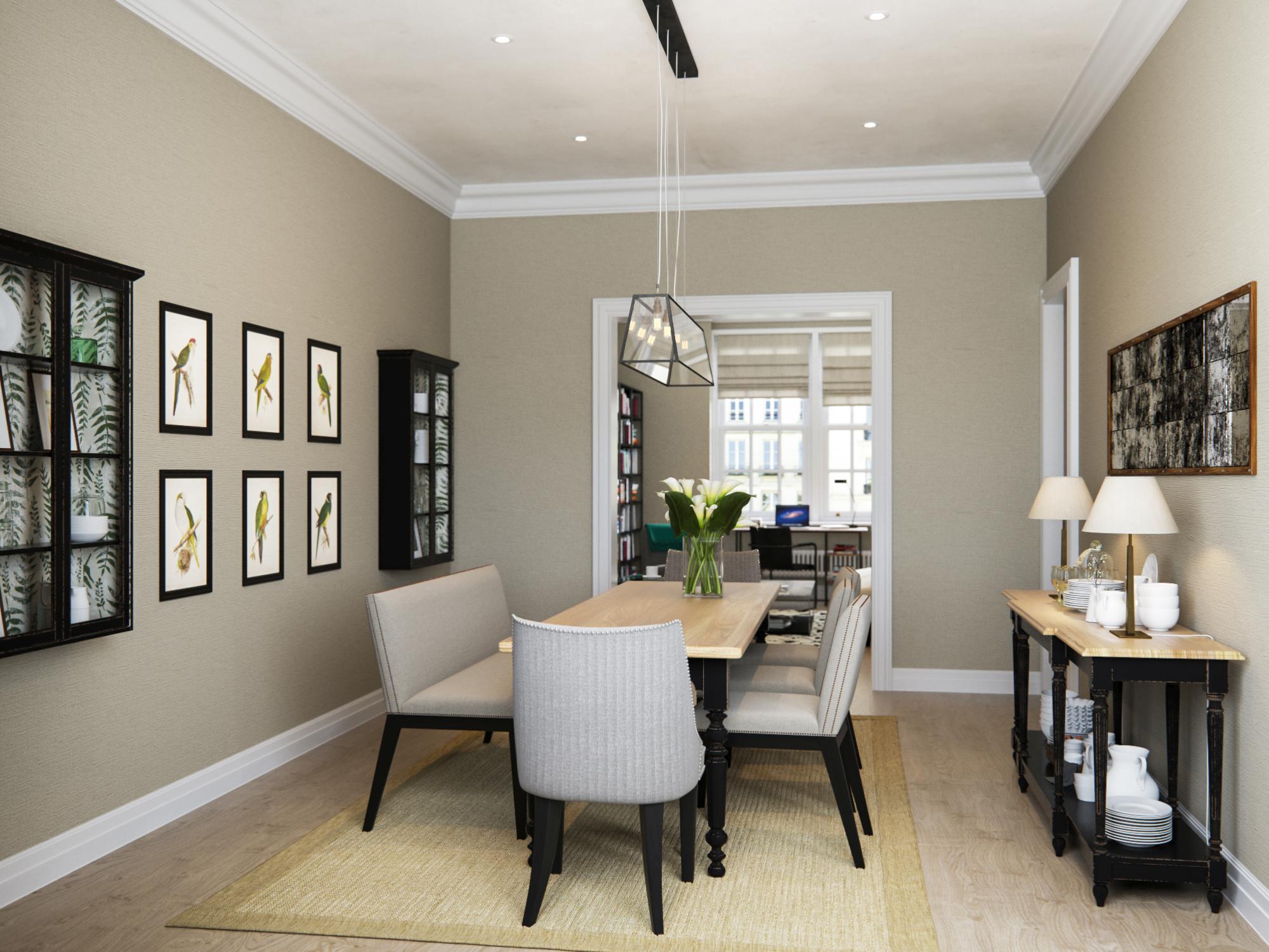
A handful of thoughtful details unite the living and dining rooms, helping them flow together. An unusual textural wall covering woven from grass is used in both spaces and black accents feature throughout. Pops of yellow on the abstract artwork, mirror frames, lampshade linings and the dining room’s parrot prints further connect the spaces. In the dining area, the furniture and console are classic in style, but their striking black legs have a sexy, on-trend feel. The slim cabinets pick up the black theme, but are lined with a botanical print, turning practical display space into something witty and fresh. Fitting them on the walls keeps precious floor space free and helps this space to flow.
Furniture with an open design, rather than solid sides, has been used throughout the apartment to help it feel spacious. In the dining room, the gorgeous console table provides lots of storage, but despite its generous size still looks light and does not seem to eat up space. Good lighting also helps the apartment multitask. Here, a striking box pendant light made from weathered brass with glass sides hangs over the table and its four squirrel cage bulbs bring a unique, slightly industrial feel. Lamps sit on the console while an antiqued mirror helps bounce light around.


